When you think of a call-to-action (CTA), a few basic examples might pop into your head. You’ve likely seen plenty of CTAs in your time as a nonprofit fundraising professional, most of them probably simple phrases like “Donate Now!” or “Give Today!” But you’ve been in the fundraising space long enough to know simple phrases without context don’t cut it anymore — you need to be more intentional when designing and implementing your CTAs.
Prospective donors need more information to decide if they want to donate, and they need to feel inspired and motivated to give. Especially in the age of the coronavirus where virtual fundraising is the principal mode of donor communication, your CTAs need to be impactful, persuasive, and effective at converting web visitors to true supporters.
To craft CTAs that lead prospective donors to your online donation form and encourage them to contribute, there are a few strategies that work best, including:
1. Go beyond the basics with your wording.
2. Keep your message brief and boost the urgency of your appeal.
3. Create a well-designed button.
4. Place buttons strategically throughout your website.
5. Use CTAs in your social media.
Here at Donately, we understand how important online fundraising is for nonprofits. Our clients use our virtual fundraising platform to create streamlined, well-designed donation forms, but they know their forms won’t be effective without a persuasive CTA that drives people to donate. These are the best strategies we’ve noted for creating CTAs that convert passive visitors into active supporters.
Let’s get started!
1. Go beyond the basics with your wording.
Your nonprofit’s website is the first place many supporters go to get more information on your mission and how they can give to the cause. This means the CTAs on your website have to go beyond the basics and deliver specific, actionable information so supporters know exactly what their donations will be funding.
Therefore, it’s critical to use descriptive action verbs that stand out. Words like “fight,” “advocate,” “save,” “combat,” and “intervene” are powerful action verbs that convey stronger imagery than just saying “help us” or “donate now” without any other context. For instance, “Donate now to combat climate change” is a more powerful statement than “Donate now” because it lets donors know exactly what their gifts will go toward.
Additionally, your CTAs should position your prospective donors as the protagonist whose generous contributions accomplish your goals. For example, don’t say “Your donation helps us fight hunger.” Say instead “Join the fight against hunger!” This makes the donor feel as though they have a direct impact on your mission, rather than playing a less-important, secondary role.
Finally, this blog post on strengthening CTAs recommends giving your donors a specific problem to solve. Everyone likes to picture themselves as the hero who is part of the solution to a prevalent problem or issue. Here’s an example from the American Heart Association — this is a pop-up CTA that appears when visitors click on the homepage:

This CTA lets donors know that their support helps save people from heart disease and stroke. This is a very tangible, specific goal that donors can easily wrap their minds around and understand how their contribution fits into the bigger picture.
2. Keep your message brief and boost the urgency of your appeal.
Website CTAs should be brief and punchy. Since CTAs are typically buttons, it doesn’t make sense to include multiple sentences of text. Prospective supporters won’t take the time to read an appeal if it’s too long, so it’s important to keep your linked CTA text to around two to five words. However, feel free to use a few sentences to lead into your CTA to provide context for your fundraising efforts.
In particular, use the lead-in to the CTA to boost the urgency of your mission. Explain why donors need to give right away, not in a week or a month.
For example, here’s an impactful CTA on the homepage for the African Wildlife Foundation:
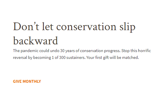
“Don’t let conservation slip backward” is a highly effective statement because it paints a vivid picture of what could happen if donors don’t contribute to this cause. It sends the message that 30 years of conservation progress could vanish unless donors give immediately.
This CTA also follows another fundraising best practice — it immediately points supporters to a form where they can set up recurring gifts. Monthly donations provide a consistent revenue stream for nonprofits while allowing donors to make a greater impact with their contributions. They also allow supporters an outlet to immediately act on the urgency of your message and start contributing regularly to your cause. Be sure to incorporate CTAs that promote your organization’s monthly giving program to take advantage of this fundraising opportunity.
3. Create a well-designed button.
Sophisticated web design should be one of your nonprofit’s guiding virtual fundraising priorities. Whether you’re designing your entire website, embedded donation forms, or CTA buttons, focus on boosting user experience and maintaining the aesthetics of your brand.
Specifically, when creating your CTA buttons, choose a font and colors that align with your brand guidelines. Also, be sure to design your button with colors that stand out against the background. Your CTA button should be clear and visible on every page to draw attention and guide readers to the logical next step. Creating high-contrast buttons also ensures that you won’t be excluding any supporters with visual impairments. Otherwise, they may struggle to see, understand, and interact with the CTA.
Further, Donately’s donation page tips emphasize that your CTAs should lead individuals directly to your donation form. This makes the process as straightforward as possible and ensures you aren’t forcing donors to jump through hoops to give to your cause.
4. Place buttons strategically throughout your website.
Don’t just slap a random button on every page of your website without context in hopes that visitors will eventually stumble across your donation form. Be strategic with your placements for a stronger likelihood of conversion.
For example, you should place a CTA on your homepage after a brief lead-in paragraph that warms the reader up to your cause. Some visitors go to your website with the express purpose of donating, so including these obvious CTAs helps them follow through with their intended action without getting sidetracked along the way.
For example, Morweb’s roundup of best nonprofit websites includes Greenbelt, the land trust for Essex County, Massachusetts. Check out this CTA from Greenbelt’s homepage:
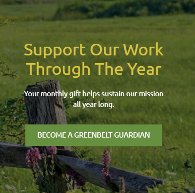
This CTA appears when someone clicks on their website, and it includes a strong message that encourages individuals to “Become a Greenbelt Guardian,” placing supporters in the center of their nonprofit mission.
Also, you can place a CTA at the end of your mission or About Us page. After visitors read all about your nonprofit and its mission, they’ll have a baseline understanding of what you do and why. After that, it’s a natural place to offer them a convenient link to your donation page.
Lastly, you’ll want to include a button or link to your donation page in the top navigation bar of your website so that no matter what page visitors click, they’ll be able to see your donate button at the top.
In the course of your regular nonprofit website maintenance, be sure to click all your CTA buttons to determine if all the links are working, and ensure they’re all positioned in the best spot on each page. You can even conduct a few tests to see if switching up the location or wording of your CTAs has any impact on the number of donations you receive in a given period.
5. Use CTAs in your social media.
Social media is a critical part of your CTA strategy because it offers a natural link to your website or donation forms.
For example, with paid Facebook ads, your nonprofit can upload a compelling image or graphic related to your cause. Then, the link users click on at the bottom of the ad can contain an impactful CTA such as “Act now to combat child poverty” or something similar that’s related to your mission.
These ads have the potential to reach thousands of supporters due to the far reach of social media. By linking to your donation page, you have the potential to grow online donations for your organization while introducing your message to a wider audience.
As this guide to online fundraising states, “online fundraising allows donors to contribute to their favorite causes the moment inspiration strikes.” By optimizing your social media CTAs, you can ensure that your online giving page will be positioned to solicit donations from multiple sources, not just your website.
Overall, crafting a strong CTA strategy is one of the most effective ways to drive more traffic to your online donation page and boost your virtual fundraising revenue. Be sure to be specific with your language, infuse a sense of urgency into your message, and be strategic about your CTA design and locations. With these proven best practices in mind, you’ll be able to create CTAs that stand out to supporters and inspire them to give.
Good luck!
Guest Author: Andrew Berry
Andrew is the head of marketing and customer success for Donately. After getting involved with nonprofits at a young age, he discovered a passion for helping the organizations that are making the world a better place. Knowing how vital online fundraising has become, his goal is to help nonprofits raise more money online each year! In his spare time, you will find him cooking up dinner, playing with his dog or cheering on Boston sports teams.
Consider grabbing a copy of my Best Practices In Social Media that include the different types of posts you should be using and a suggested weekly calendar.
Development Consulting Solutions has a team of experts who can meet your needs by serving as your grant reviewer, grants researcher, proposal template developer, and ongoing grant writer. Check out our list of grant writing services here. Contact us today to discuss your grant writing needs.
Join my new nonprofit “community” who are surviving and thriving! Click HERE to join my private Facebook group: Nonprofit Survive and Thrive Mastermind and receive support and inspiration to drive your results.
Get my {FREE} Build a Better Board Ebook…
Many Board of Directors still operates at the management “Day to Day” operational level not realizing that, in fact, they have a far more significant and greater responsibility to stewarding the health of the organization.
In this FREE e-book, learn:
- What is good governance and what is not
- How to build your best Board now
- How to move your organization from management to governance
- and, how to ensure the future stability of your organization!
https://developmentconsultingsolutions.ac-page.com/nonprofitgovernance
For a free, 30-minute consultation, or to learn more about our “Survive and Thrive” professional coaching services, visit us here at www.developmentconsultingsolutions.com/coaching or book your fundraising coaching session at http://calendly.com/developmentconsultingsolutions/30min.




Leave a Reply
Want to join the discussion?Feel free to contribute!